
| This afternoon the students reviewed why we use graphs and different types of graphs (bar, pie, etc.).Then they will create a line graph using the Jamestown Population spreadsheet data. They will add a chart title and axis labels. The students will use Apple Keynote to create their Infograph. They will start a new presentation, select a template and copy over their graph. Then they will add images to make the graph easier to understand. | 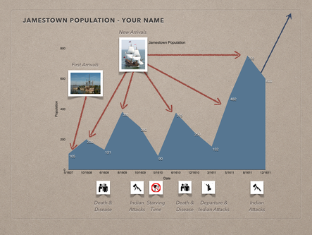 Click here for Jamestown Resources |
|
0 Comments
Leave a Reply. |
AuthorEvelyn Chaleki, Gretchen Komnik, Kate Harter Frequently Used
Gallery
Archives
March 2018
Categories |
 RSS Feed
