
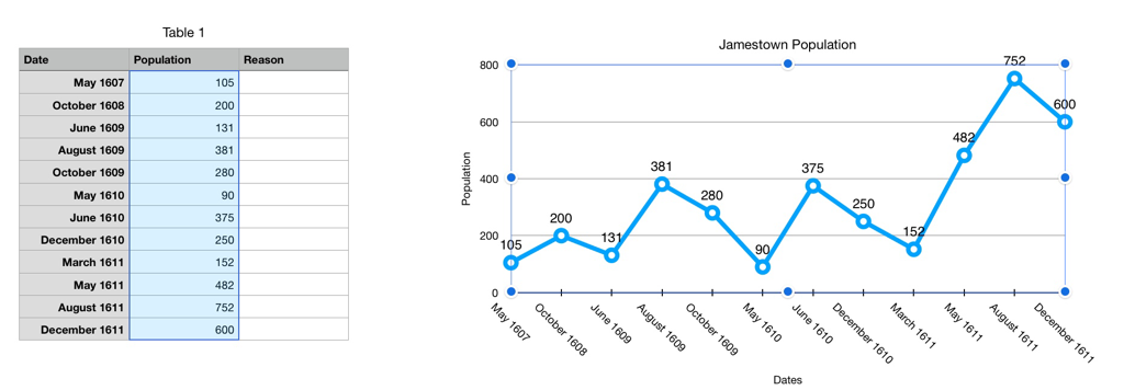
Today the students reviewed why we use graphs and different types of graphs (bar, pie, etc.).Then they created a line graph using the Jamestown Population spreadsheet data. They added a chart title and axis labels.
The students used Apple Keynote to create their Infographic. They started a new presentation, selected a template and copied over their graph. In the next class they will add images to make the graph easier to understand.
The students used Apple Keynote to create their Infographic. They started a new presentation, selected a template and copied over their graph. In the next class they will add images to make the graph easier to understand.
 RSS Feed
